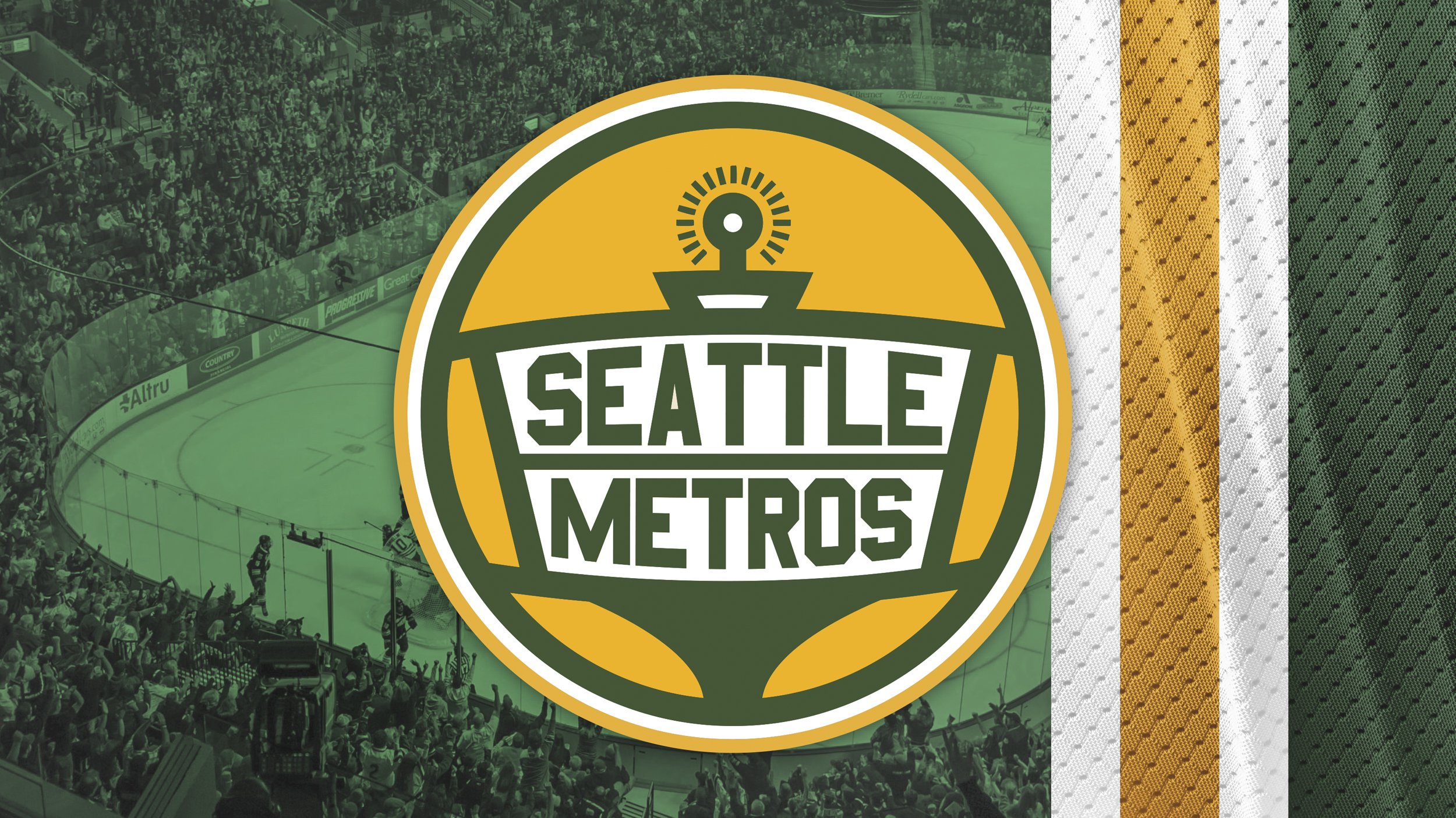
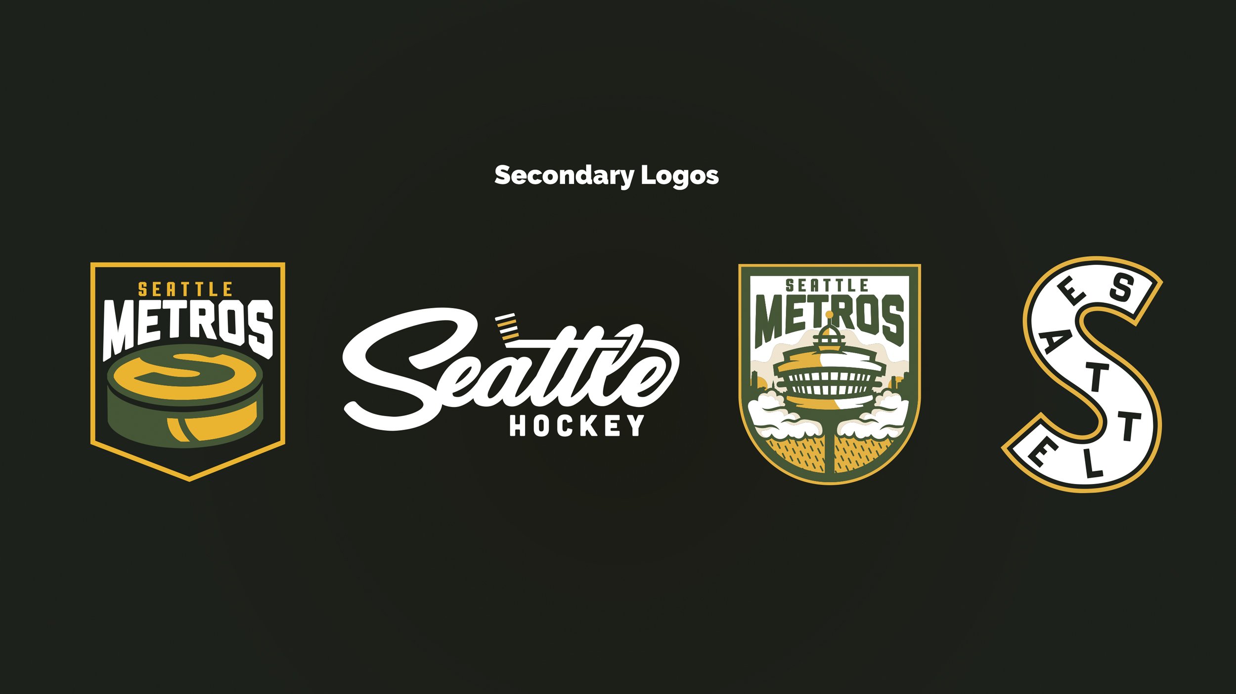
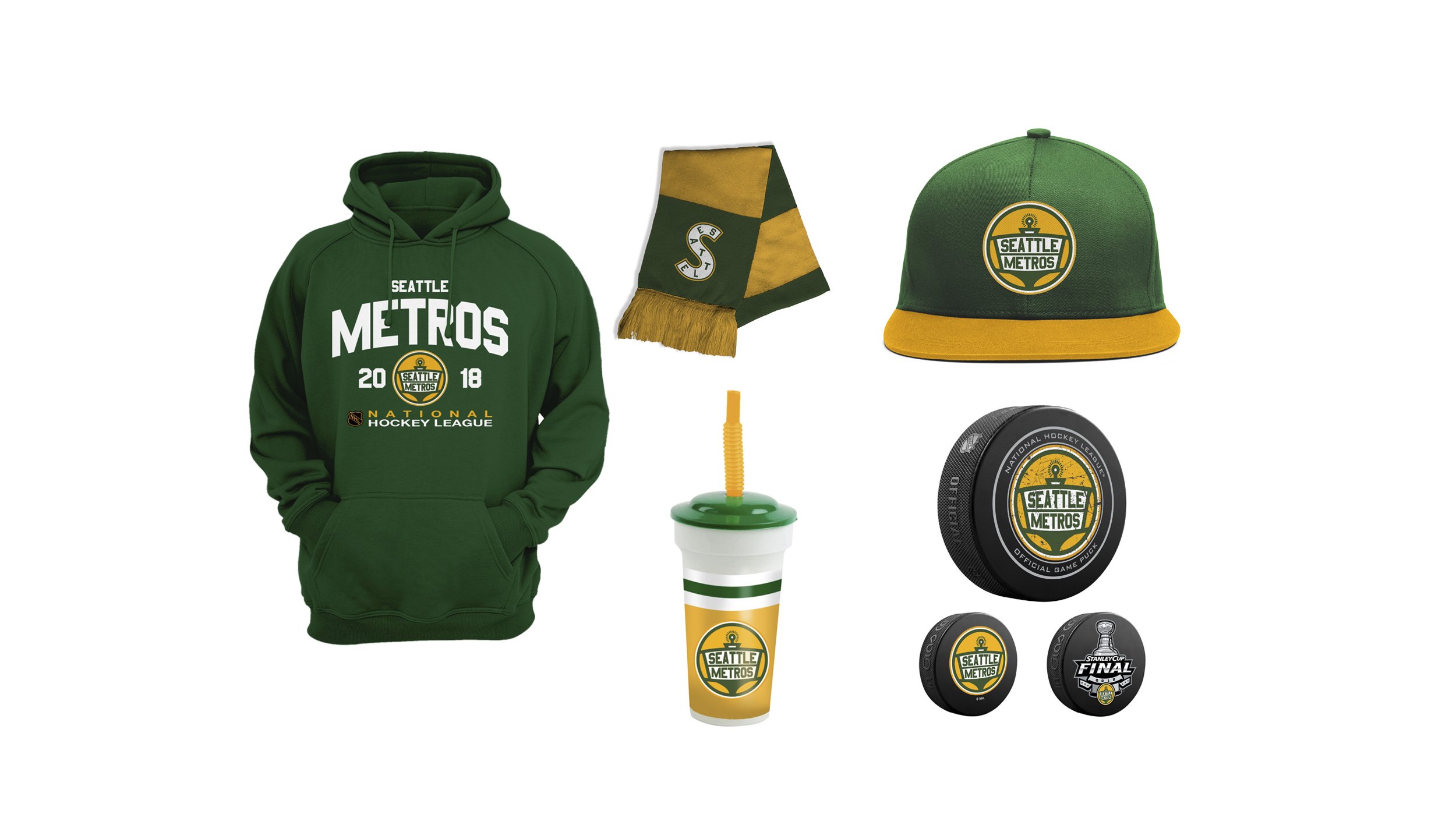
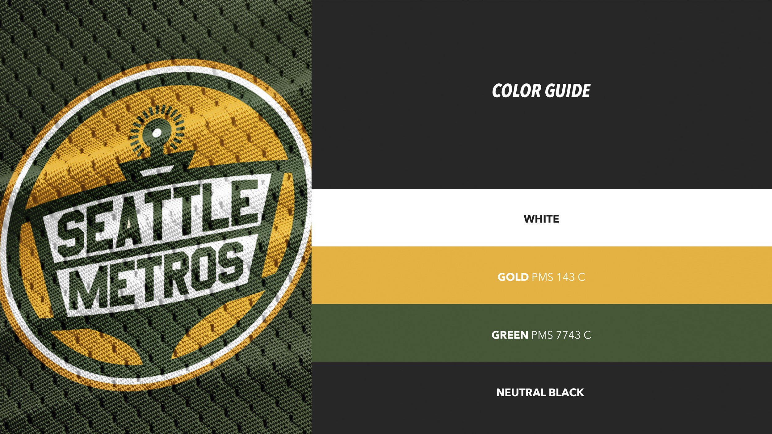
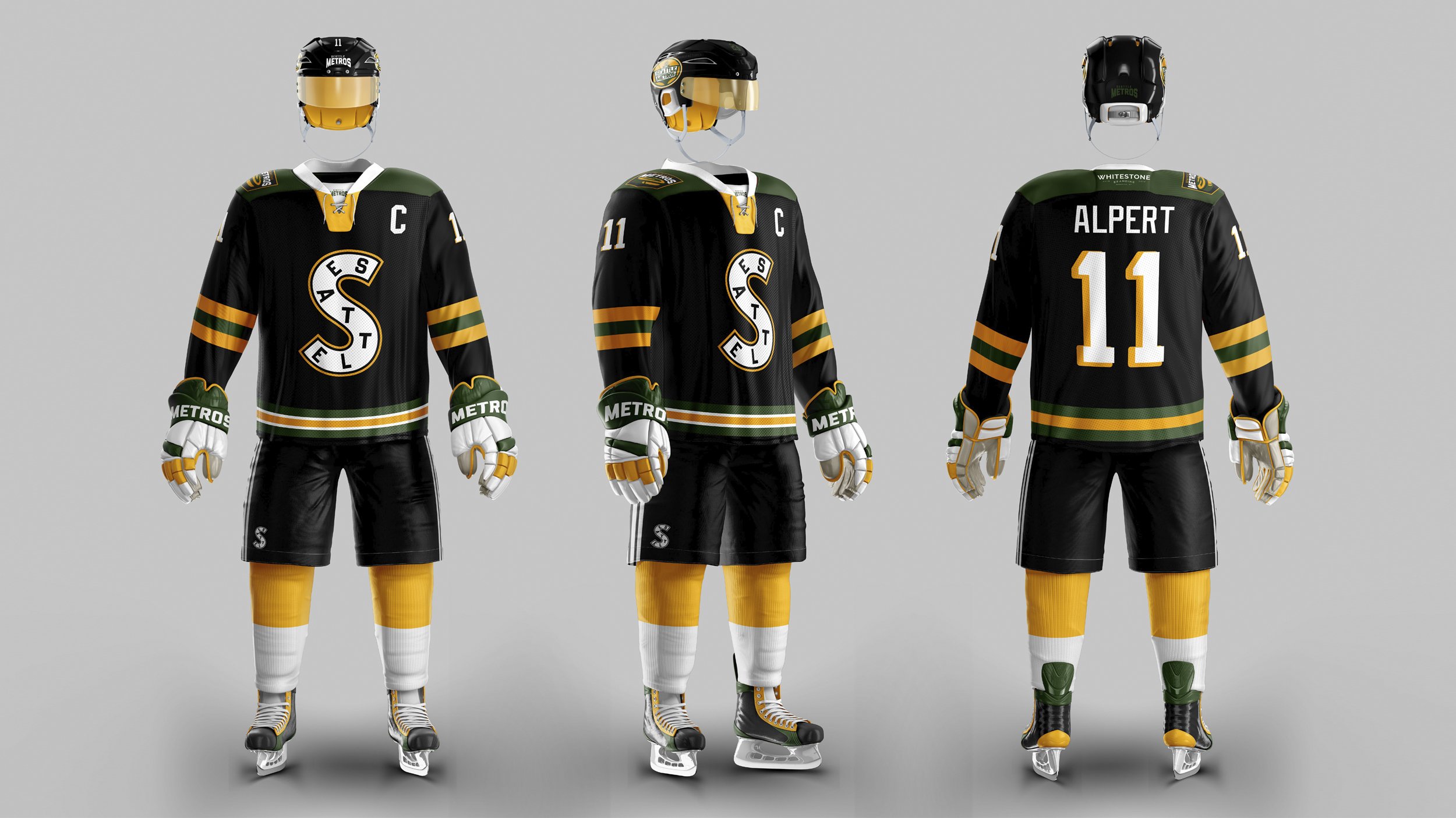
In 2017 we decided to throw our hat in the ring and come up with a full brand build for the rumored NHL expansion team that was coming to Seattle. We did a lot of research on this including things about the history of Seattle and its relationship with hockey. We utilized the color ways of the now defunct NBA team the Supersonics - a technique that many city’s teams do in matching colors. In our main logo we included the city’s most recognizable icon… the space needle.